Lo-fi wireframes from Claude: the design thinking shortcut nobody talks about
Using Claude to generate rough layout options mid-design isn't about output — it's about thinking faster without having to build your way to a bad idea first.
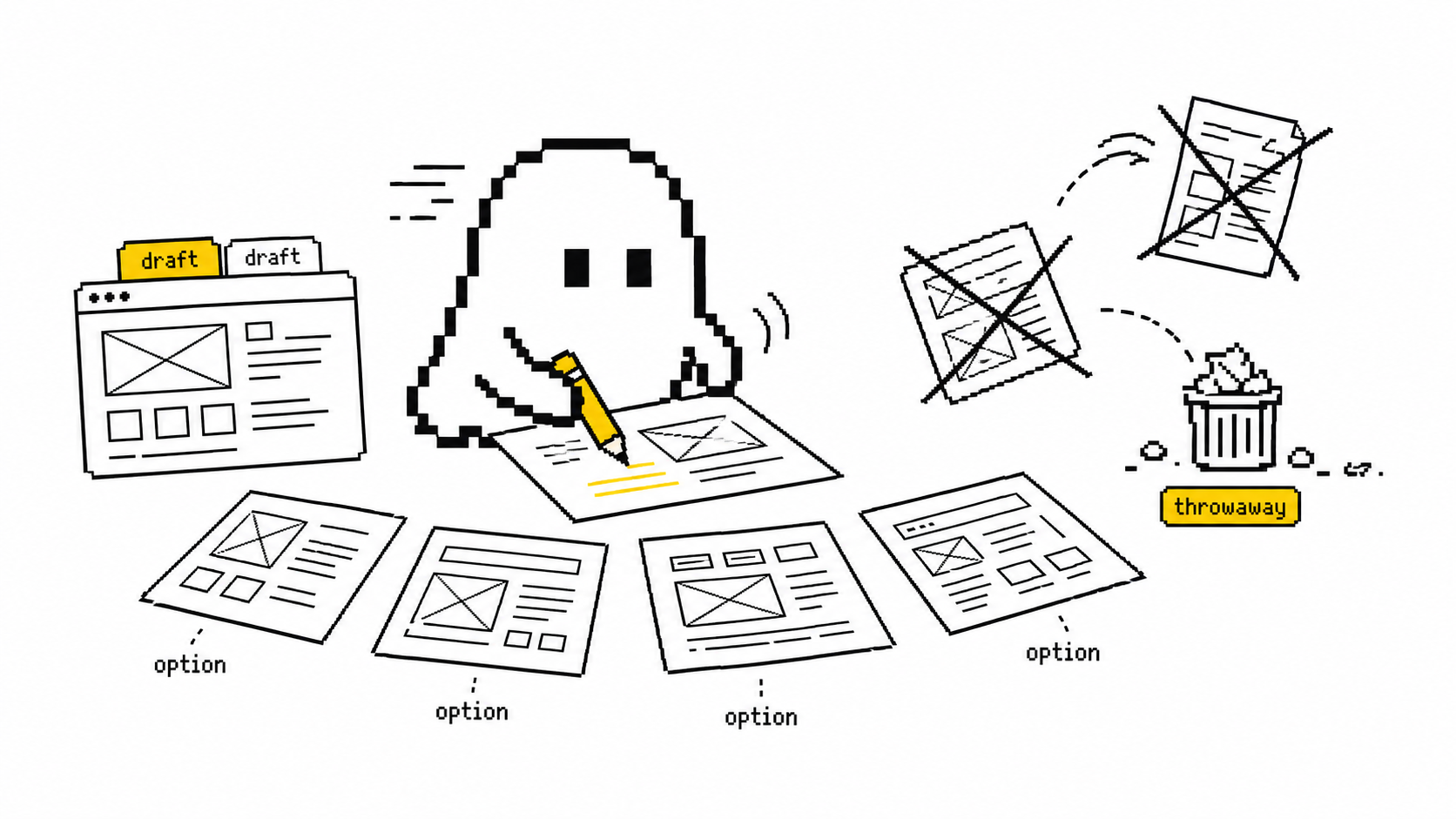
Most designers use AI to produce a layout. That's the boring use. The real unlock is using it to think — seeing five rough versions of an idea before you've committed to building any of them. The output is disposable. The thinking is the point.
Here's the trap the tools don't tell you about. The slow part of design was never the drawing. It's that you have to build your way to a bad idea before you find out it's bad. You commit to a structure, push pixels for two hours, and only then feel why it's wrong. By then you're attached to it.
That's the sunk-cost tax. Once you've invested effort, you defend the artifact instead of interrogating the idea. Polished work gets treated like a decision — people critique the font instead of the flow. The whole point of going rough is to stay honest. You can't protect pixels you spent ninety seconds on.
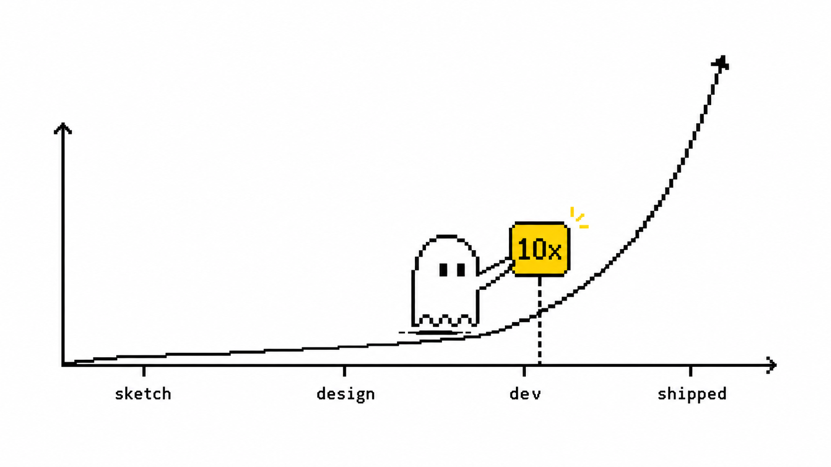
This is why lo-fi beats hi-fi early. Rough layouts are fast to make and faster to throw away, which is exactly what early thinking needs. And getting it wrong cheaply matters: per a 2023 Forrester figure, fixing a UX problem in development costs roughly 10x what it costs to catch in design. The cheapest place to be wrong is a sketch.
The fix is a change in how you use the tool, not which tool you use: stop asking AI for a deliverable and start asking it for options to react to. The teams getting real leverage out of this share a few habits:
- Describe, don't draw. Say what the screen is in plain language — "settings page, three sections, a destructive action at the bottom" — and get a rough structural pass back in seconds. Not to ship. To react to. The fastest way to learn what you actually want is to look at a version you don't.
- Diverge on demand. Ask for the same screen three different ways: "dashboard-first," "wizard-style," "single dense table." You're not picking a winner. You're widening the option space before your brain narrows it — which it does, fast, around the first idea it sees.
- Treat every output as a thinking artifact, not a deliverable. Use it to surface the questions you'd otherwise miss: What's the primary action here? What did I forget — empty states, errors, the unhappy path? Does this structure survive on a phone? The layout is a prompt for your judgment, not a replacement for it.
- Use it for breadth, not taste. Research on generative UI tools finds they're strong on speed and variety, weak on taste and context. They'll happily hand you a confident, generic, slightly-wrong layout. That's perfect for divergence and dangerous as a decision. The model opens the option space; you still close it.
- Decide in the room. Rough out three structures live in a stakeholder or eng conversation, while the debate is still warm, instead of "let me mock this up and circle back Thursday." Decisions get made when everyone's looking at three concrete options, not one person's verbal description. The deeper point: AI's gift to design isn't faster pixels. It's permission to think out loud in layouts — cheaply enough that being wrong costs nothing. The bottleneck in early design was never execution speed. It was the cost of discovering, too late, that you'd committed to the wrong shape. Drop that cost to near zero and you don't just design faster. You explore more before you commit, which is a different and better thing. Try this on your next screen. Before you open your design tool, write a one-line description and ask for three structurally different versions. Spend ten minutes reacting, not refining — mark what each one gets right and what it exposes that you'd forgotten. Pick the bones of the one that feels right, then go build that. You'll have skipped the two hours you'd otherwise have spent building your way to the wrong one — and you'll have seen four ideas instead of defending your first.
Sources